projects.app - instant.consult

Instant Consult

A high-priority feature designed to facilitate rapid, on-demand medical consultations, connecting users with healthcare professionals instantly when time is of the essence.

Role
Product Designer
Industry
Healthcare
Platform
iOS & Android
Year
2026
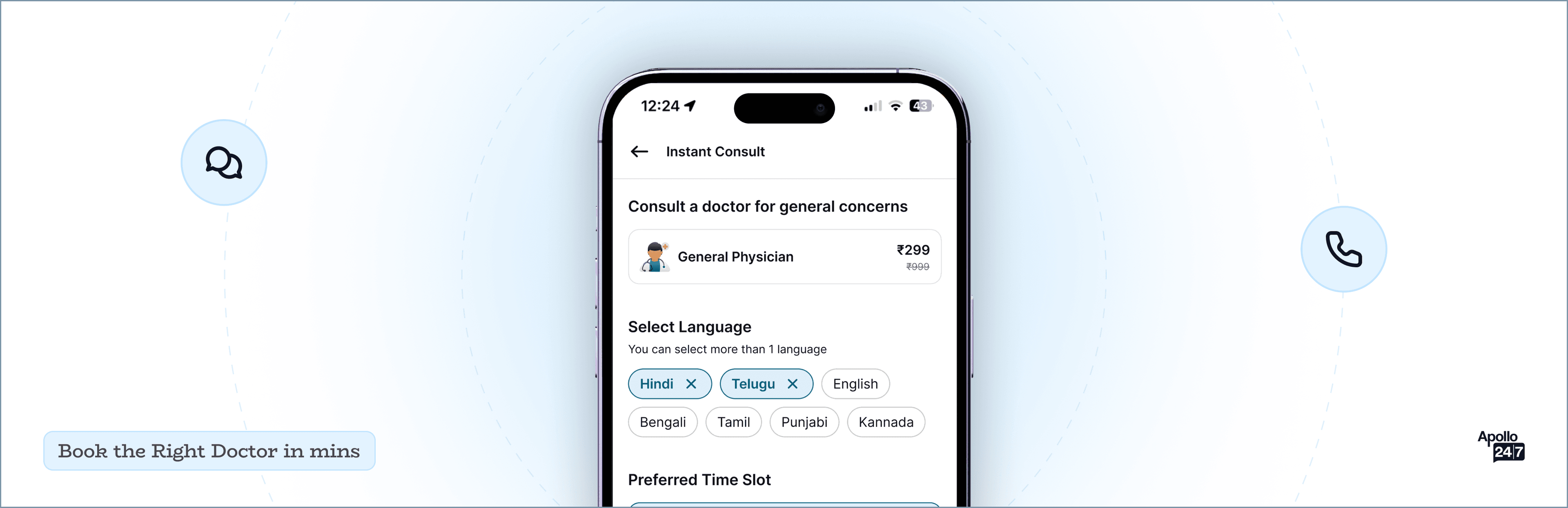
Instant Consult hero mockup

// PROJECT BRIEF

Built for planned visits. Not for Right Now.

Apollo 24/7 already had a strong consult flow — but it was built mainly for planned appointments. Users who needed quick medical help were still forced through the same journey: browse doctors, open profiles, check slots, repeat.

When someone is unwell or worried, they don't want to compare doctors. They just want to talk to one, fast.

That gap led to Instant Consult.

Current Flow

Browse / Profile / Slots / Book

Instant Consult

One screen. One doctor. Now.

// THE PROBLEM

Four patterns shown in our testing

Frustration during urgent situations

The standard flow wasn't built for people who needed help right now.

Drop-offs while searching for available slots

Users lost patience before they even reached a doctor.

Language issues

Users wanted to explain symptoms comfortably, often in non-english languages.

Confusion for the first-time users

No clarity on which doctor to pick or why it mattered.

I just want to talk to someone when I am feeling low. I don't want to scroll through a list to look for the "right doctor".
-Patient during a call with Research team

// THE IDEA

In urgent moments, users only care about three things.

Getting help fast

Explaining symptoms comfortably

A qualified doctor

They don't care who the doctor is.

So instead of asking users to pick — we let the system do that.

// THE JOURNEY

Initial Concept

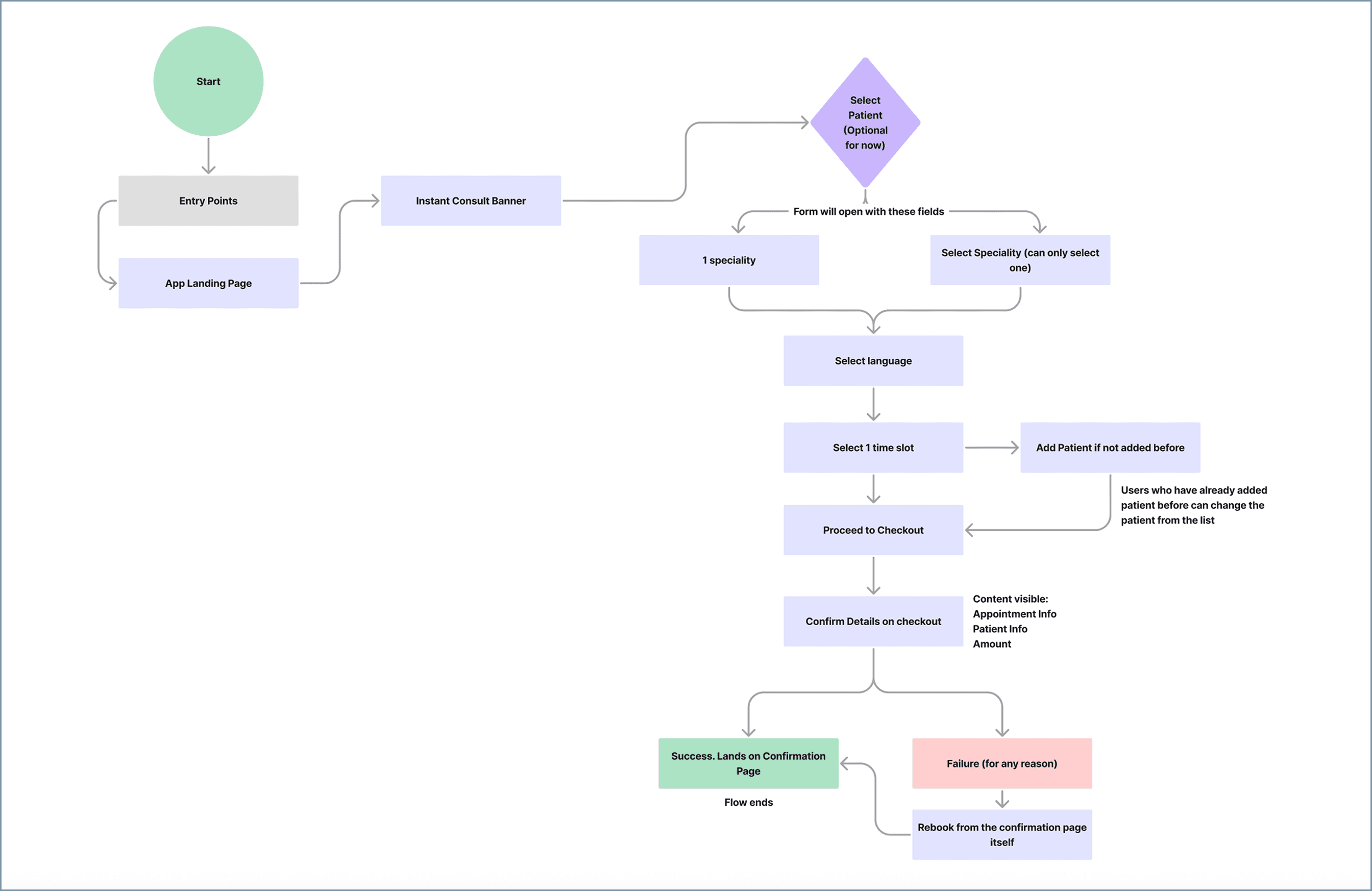
Instant Consult initial-concept flow chart

From a multi-page flow to one unified screen.

INITIAL CONCEPT

Mirror the standard flow

Plan was to copy "Regular Consult" and "Family Doctor" patterns — a multi-page journey with a separate checkout screen.

TURNING POINT

Standard patterns were adding friction

For users in urgent, anxious situations, every additional tap is a drop-off risk. The standard architecture wasn't built for this moment.

FINAL ITERATION

One unified screen

Specialty, patient, language, and time slot — all confirmed in one place before payment. Drastically reduced cognitive load and time-to-help.

// THE FLOW

Entry to consult room, in four steps.

01

Entry points

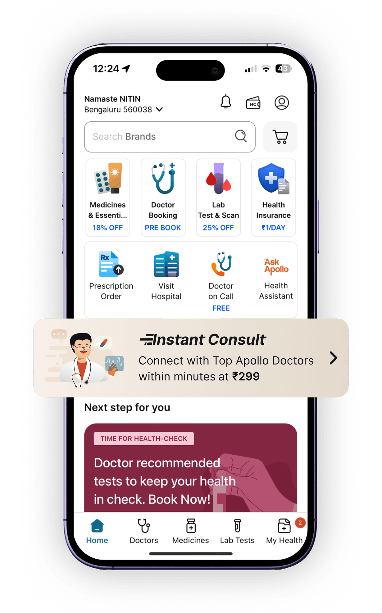
Banners on the Apollo homepage + contextual banners across Pharma sections (e.g. dermatology products → dermatologist consult).

02

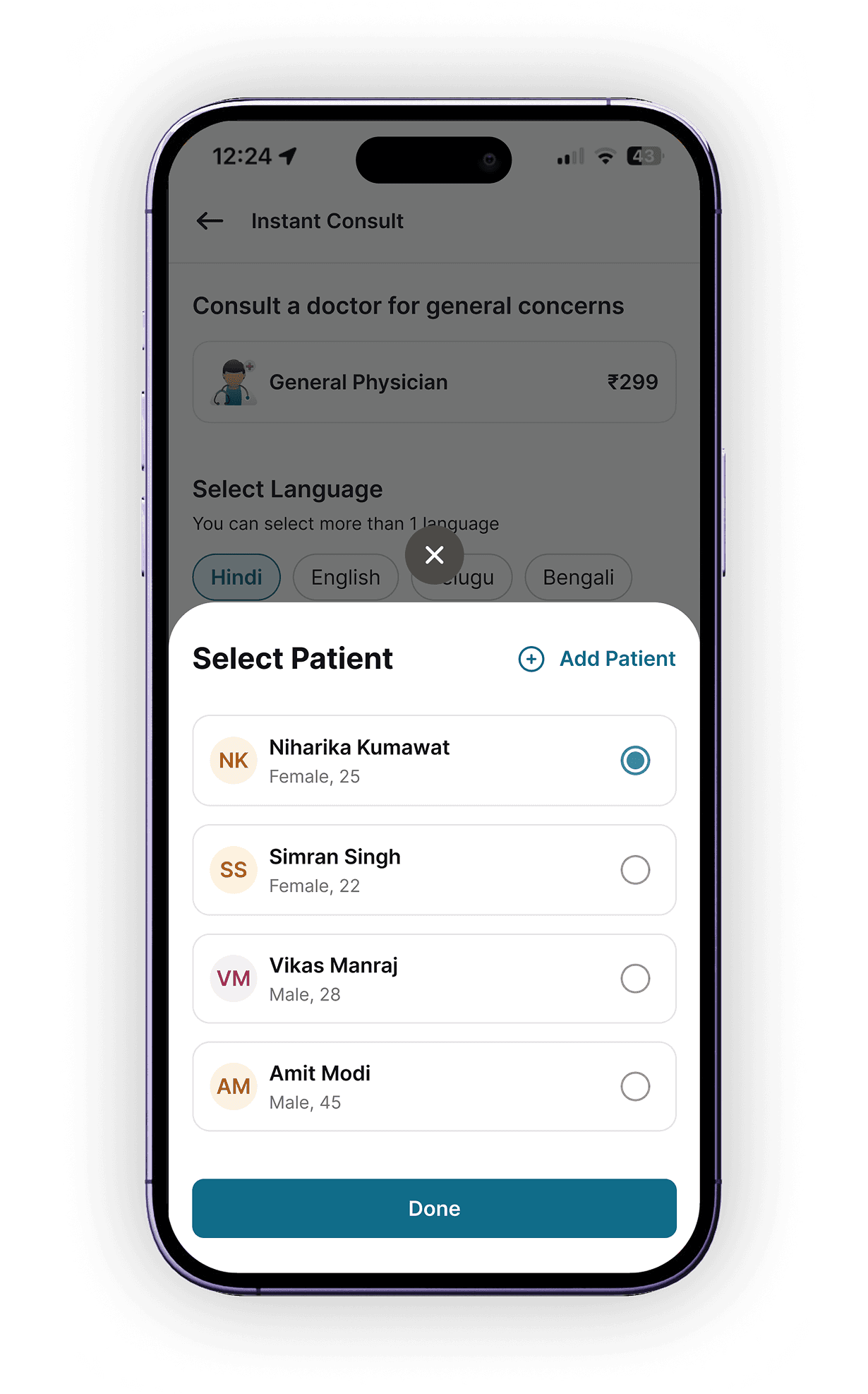
Select patient

Pre-select from existing patient profiles, or add a new one seamlessly within the same flow.

03

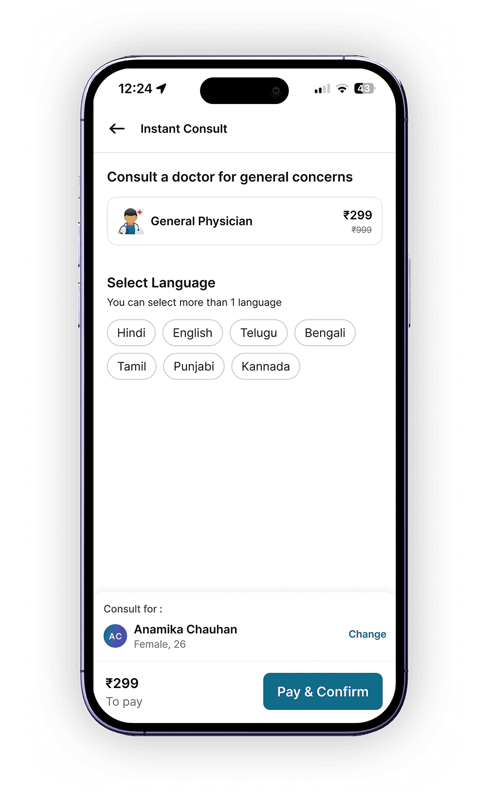
Language + slot

Languages shown based on real-time doctor availability. Time slots shown for the next 2 hours in 30-min intervals.

04

Pay & confirm

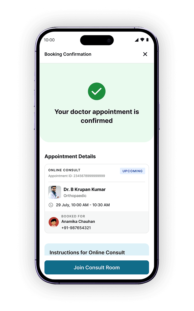
Confirmation shows specialty, patient and time then a direct path into the consult room.

// DESIGNS

Apollo homepage with the Instant Consult entry banner

1. Entry Point

Contextual banners serve as the primary entry point across the app

Select patient screen

2. Select Patient

Users can quickly select from existing patient profiles or add a new one seamlessly

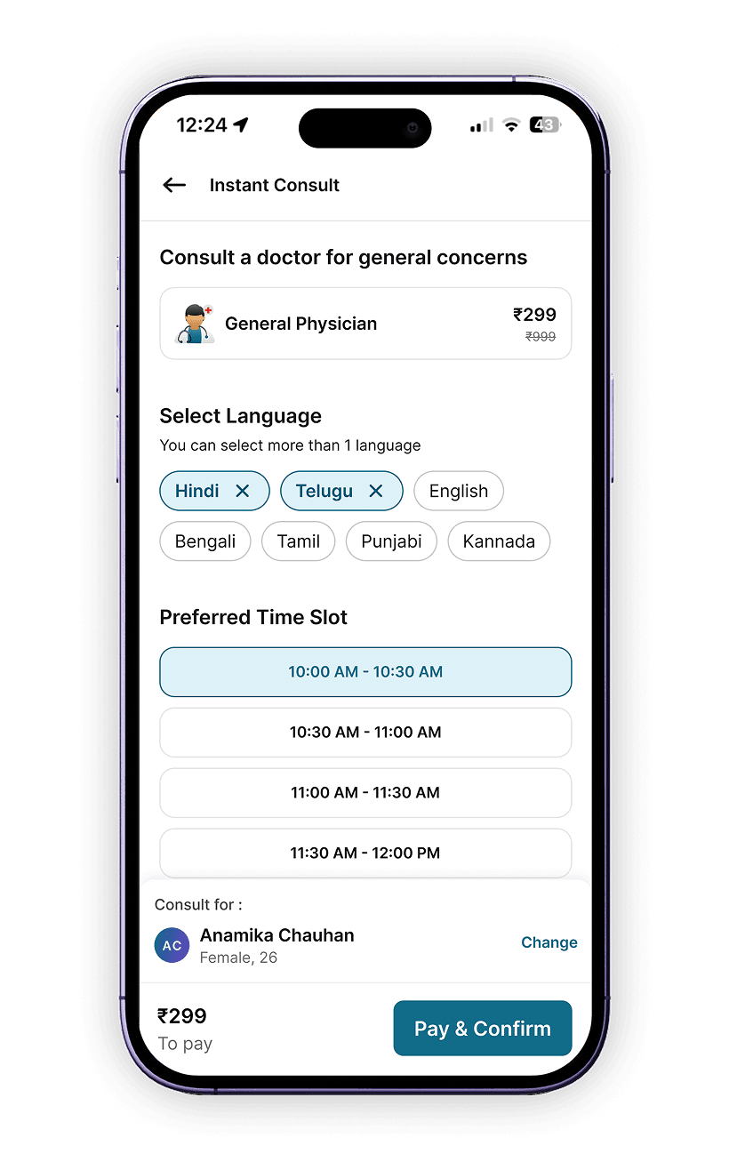
Instant Consult landing with language selection

3. Landing Page

Users confirm the specialty and select their preferred communication languages

Time-slot selection screen

4. Select Time Slot

Users pick from upcoming time slots based on real-time doctor availability

Payment confirmation screen

5. Payment Confirm

Final review of the specialty, patient, and time before proceeding to payment.

// THE EDGE CASES

Logic over layout.

01 · Dynamic Language Filtering

What if a distressed user pays, but zero doctors speak their chosen language?

THE RISK:A frustrating dead-end requiring a manual refund.
THE DECISION:Language options are dynamically mapped to real-time backend availability — unavailable languages simply don't appear.

02 · Seamless Patient Switching

What if a user books for a dependent, but their own name is attached at payment?

THE RISK:Forcing users to back out at the final step causes heavy drop-offs.
THE DECISION:Select/Add Patient built into step one — switch or create profiles without ever leaving the flow. Kept optional to avoid new friction.

// OUTCOME & IMPACT

Numbers that mean people got help faster.

+8%

Increase in total consultations, driven by improved accessibility and faster entry

3-5min

Average time to start a consult — down from 12-15 minutes

Higher completion rate, with minimal drop-offs from progressive, modular design

// FUTURE SCOPE

Instant Consult, built into every doctor's profile.

Right now, Instant Consult lives as its own entry point — separate from browsing individual doctors. The next iteration folds it directly into the doctor profile itself.

Any doctor on Apollo's payroll would be able to open a set of Instant Consult slots on their own profile — visible alongside their regular scheduled slots. Users browsing a specific doctor could book an instant slot with that doctor directly, instead of being routed to a generic queue.

Today

Instant Consult = separate flow, payroll doctor

Future Scope

Instant slots on doctor profiles, your doctor of choice

These slots would carry a small premium over a regular booking — users pay a little extra for the certainty of seeing their preferred doctor immediately, rather than the next available one. It turns "instant" into a choice users opt into per-doctor, not just a generic fast lane.

// FIGMA PROTOTYPE

That's a wrap.

Instant Consult is live on Apollo 24/7 today. Future scope includes expanding to more specialities — weight loss journeys, campaign-based consults, and condition-specific flows on this same scalable foundation.


Other Case Studies


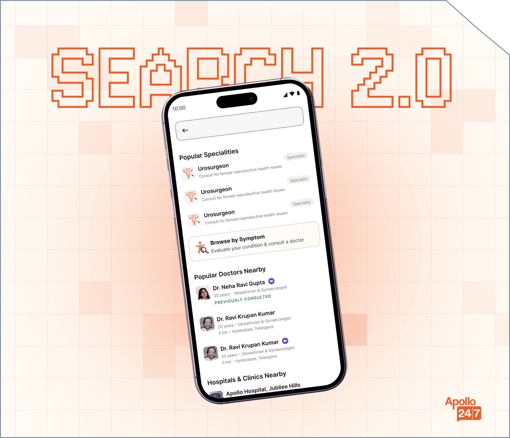
Search Revamp mockup

Search Revamp

A comprehensive redesign of the core search experience to improve discoverability, relevancy, and user decision-making for a major healthcare platform.

View
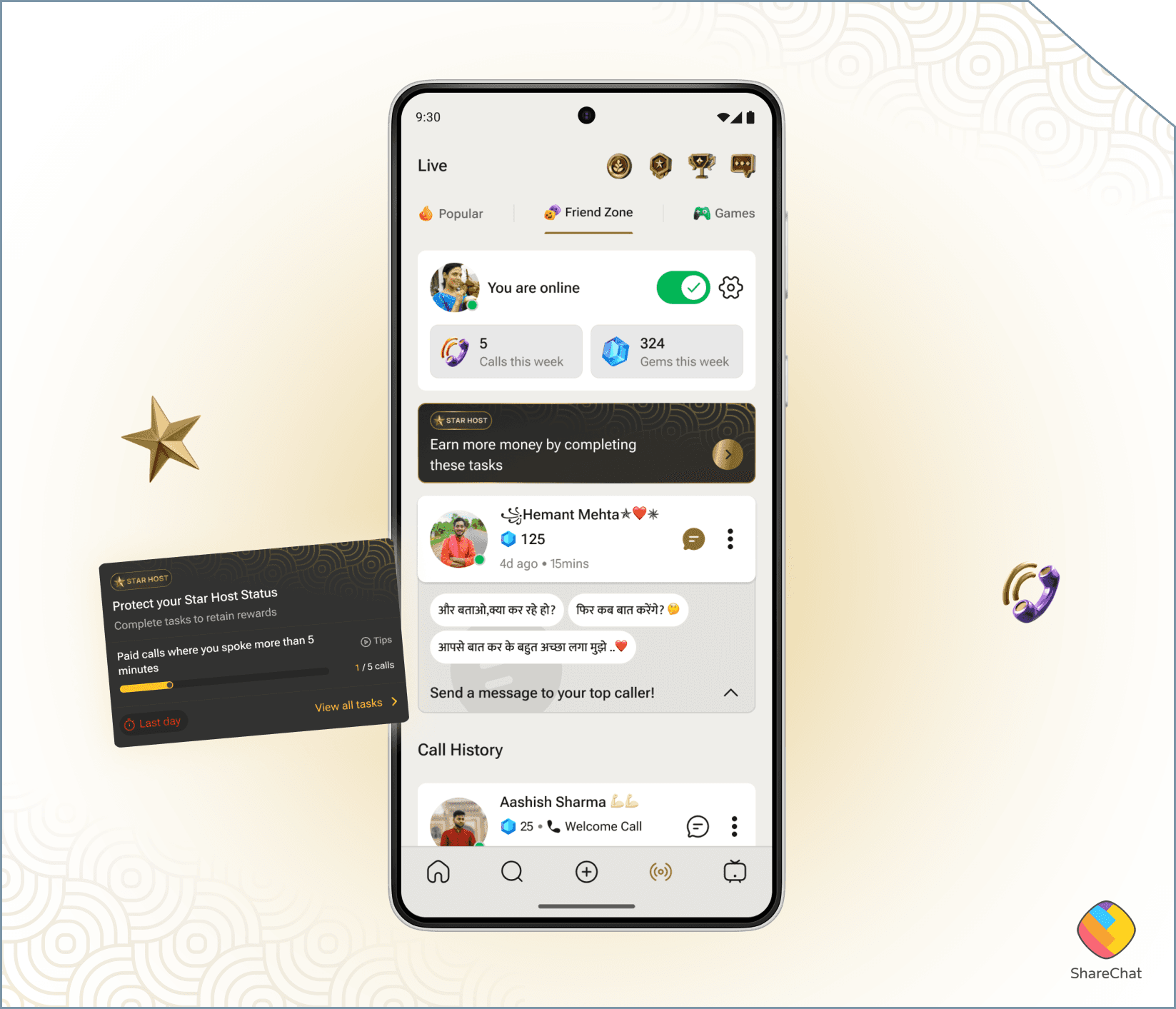
Star Host Program mockup

Star Host Program

FriendZone's host ranking was invisible — hosts had no idea why some earned more than others. I designed a system to make that ranking transparent, actionable, and motivating for a non-tech-savvy audience.

View