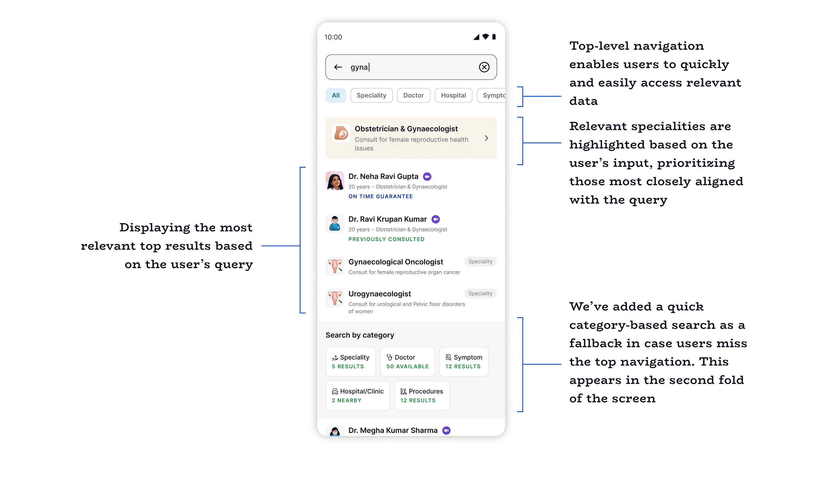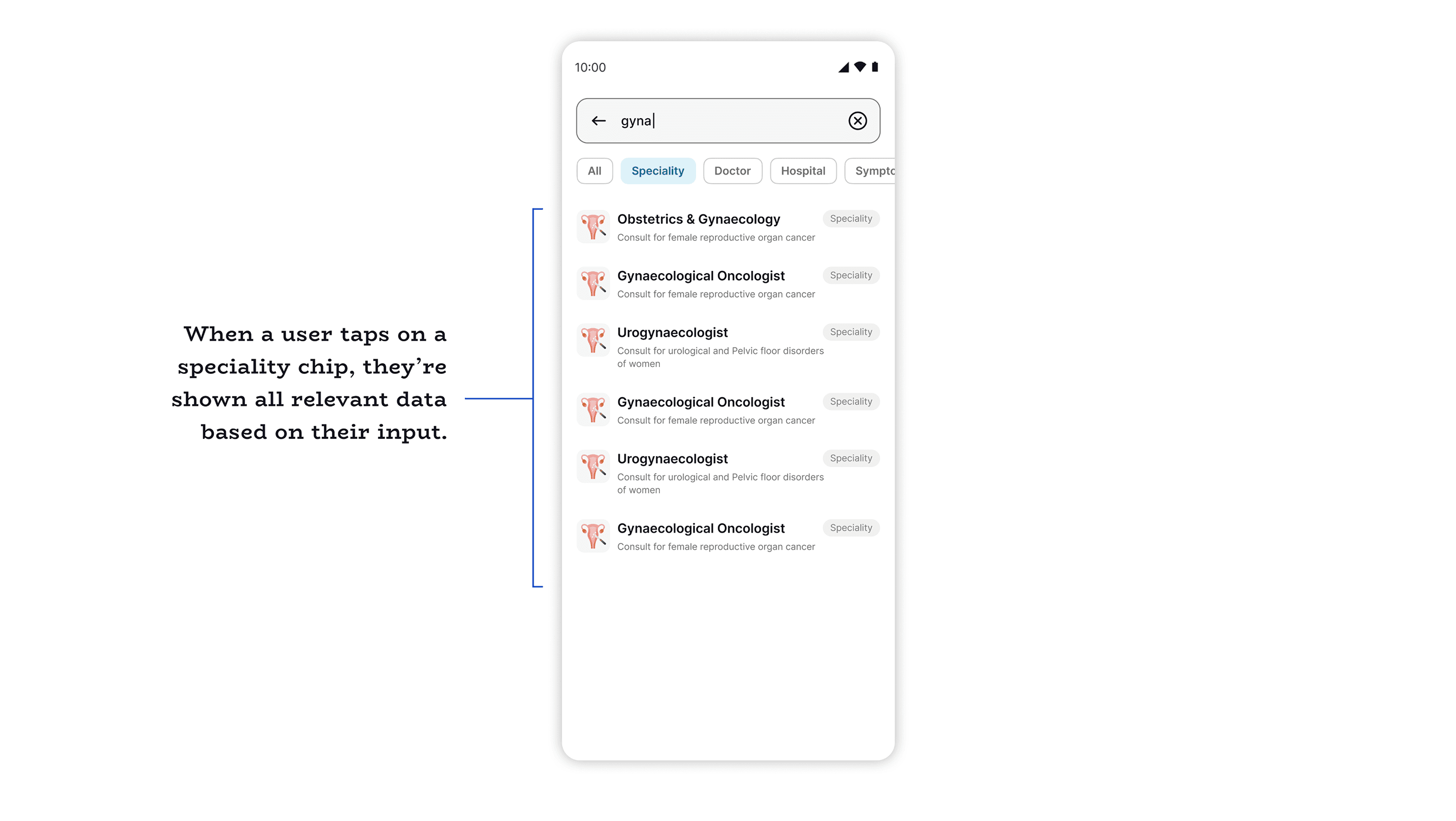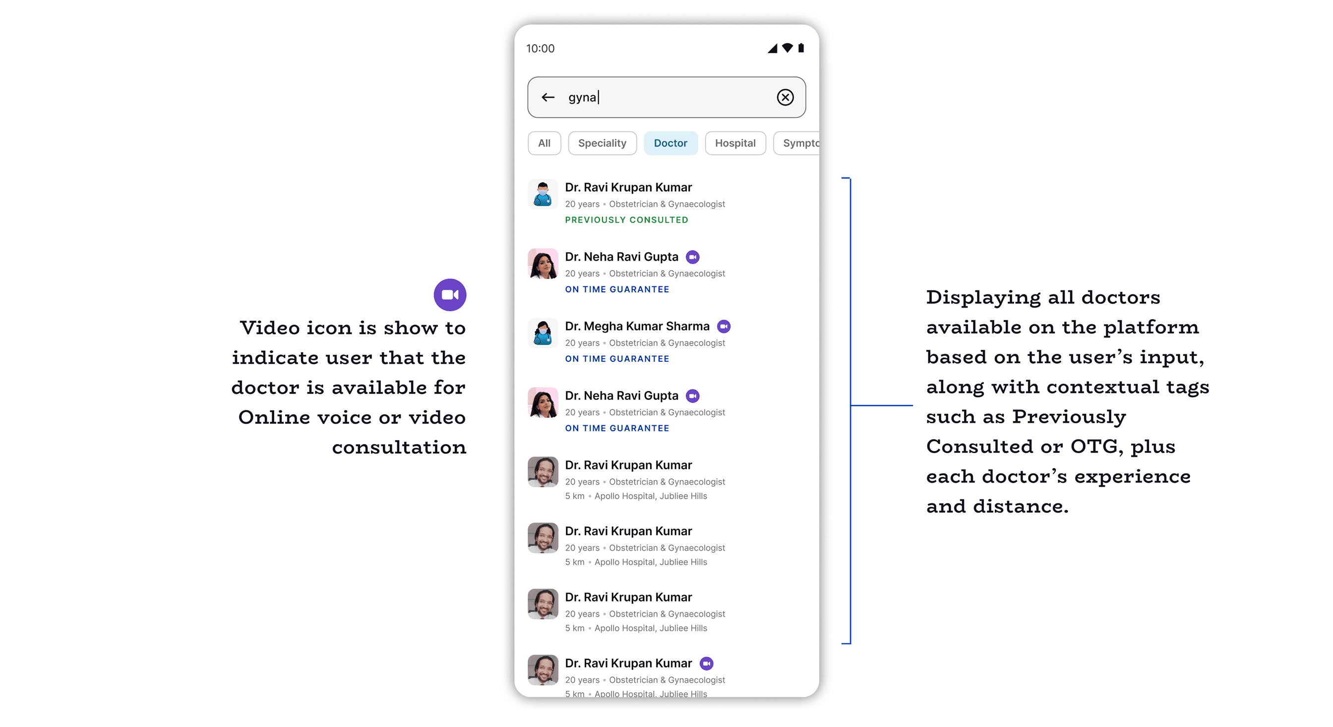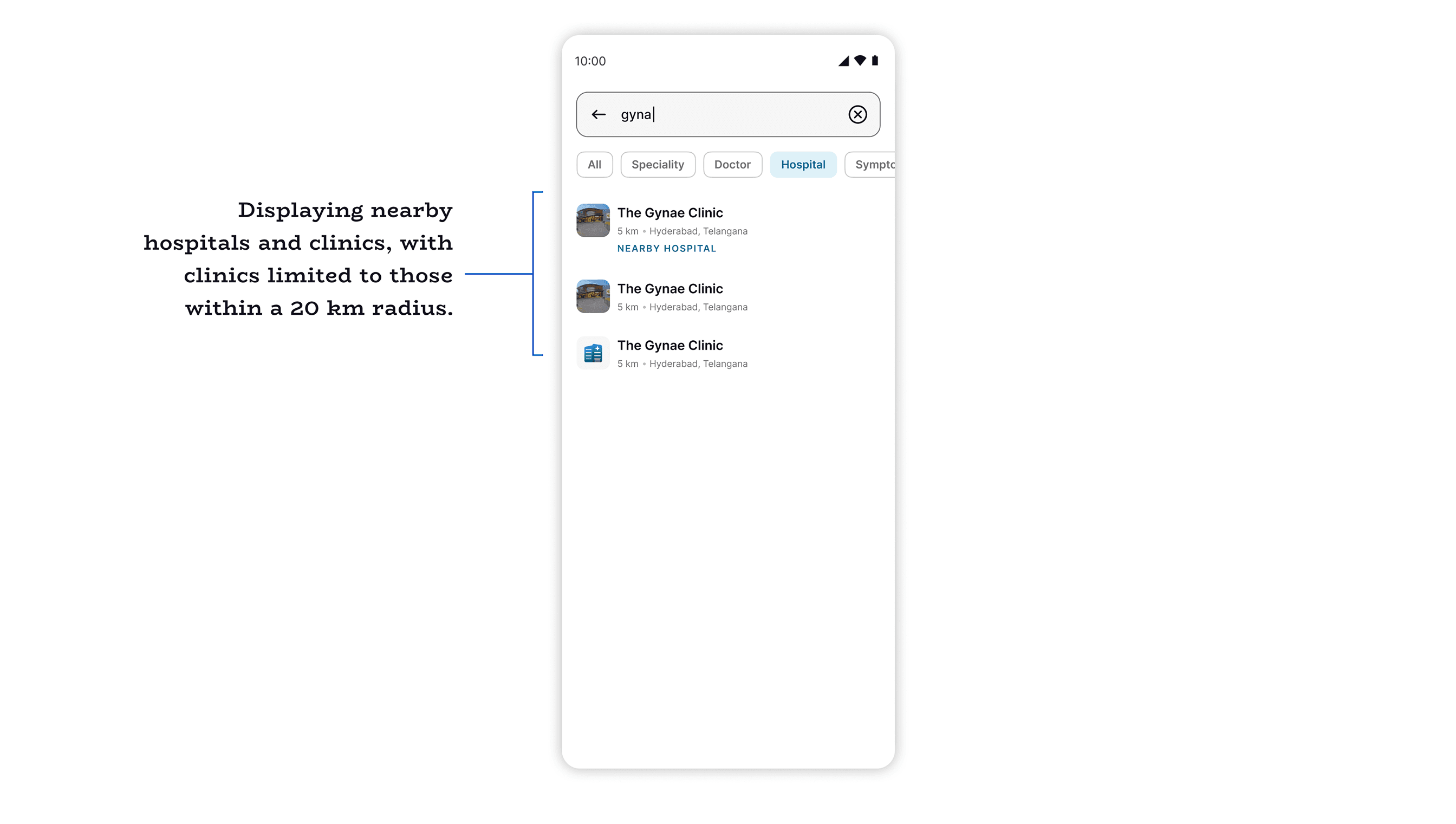
projects.app - search.revamp

Search Revamp

A comprehensive redesign of the core search experience to improve discoverability, relevancy, and user decision-making for a major healthcare platform.

Role
Product Designer
Industry
Healthcare
Platform
iOS & Android
Year
2025
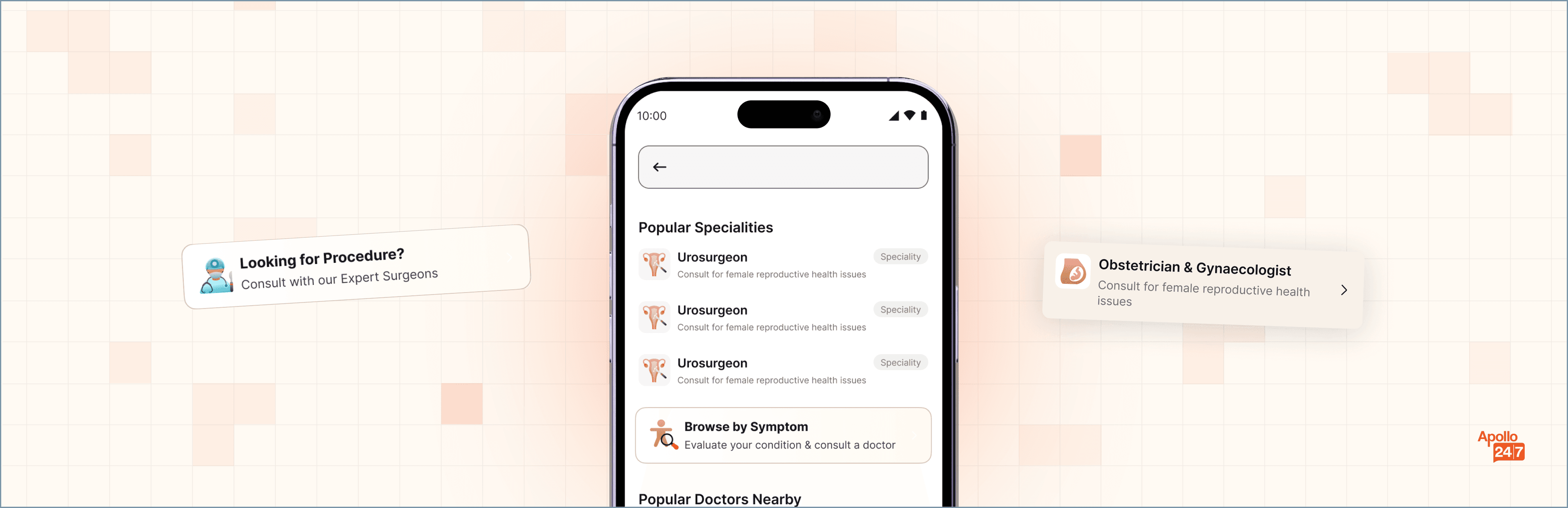
Search Revamp hero mockup

// PROJECT OVERVIEW

Search wasn't a utility. It was the front door.

60%

of users landing on the Consult homepage went directly to Search — making it a primary entry point and decision-making surface, not a secondary utility.

We initiated Search 2.0 after this insight surfaced. A detailed search analysis followed to understand exactly where the experience was breaking down for users trying to find the right doctor, hospital, or speciality.
// KEY INSIGHTS FROM ANALYSIS

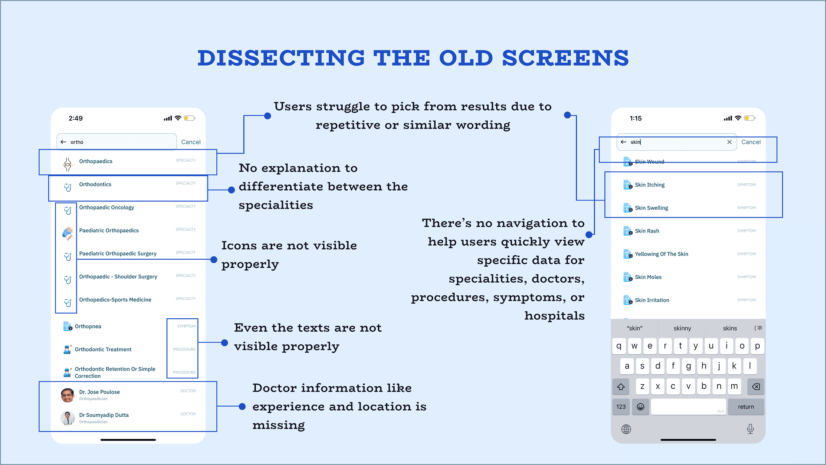
Five gaps breaking user trust in the results.

Low-value results ranking high

Clinics with only 0-2 doctors appeared at the top, pushing relevant options lower.

Unclear speciality differentiation

Users struggled to understand the difference between multiple speciality options.

Missing symptom mapping

Queries like "skin" or "gas" showed specialities but not related symptoms, breaking the mental model.

Insufficient doctor context

Location and experience, the critical decision-making details, weren't visible in results.

Poor location relevance

Users in Gurugram were seeing results from Hyderabad or Bangalore, reducing trust.

// OBJECTIVE

What this redesign needed to fix.

✓ Improving result relevance and ranking logic

✓ Adding clear contextual information to aid decision-making

✓ Enhancing query understanding — specialities, symptoms, common terms

✓ Ensuring location-aware suggestions

✓ Creating a more intuitive, confidence-building search experience

Annotated search results screen: dissecting the old screens

// FLOW CHART

Flow Chart

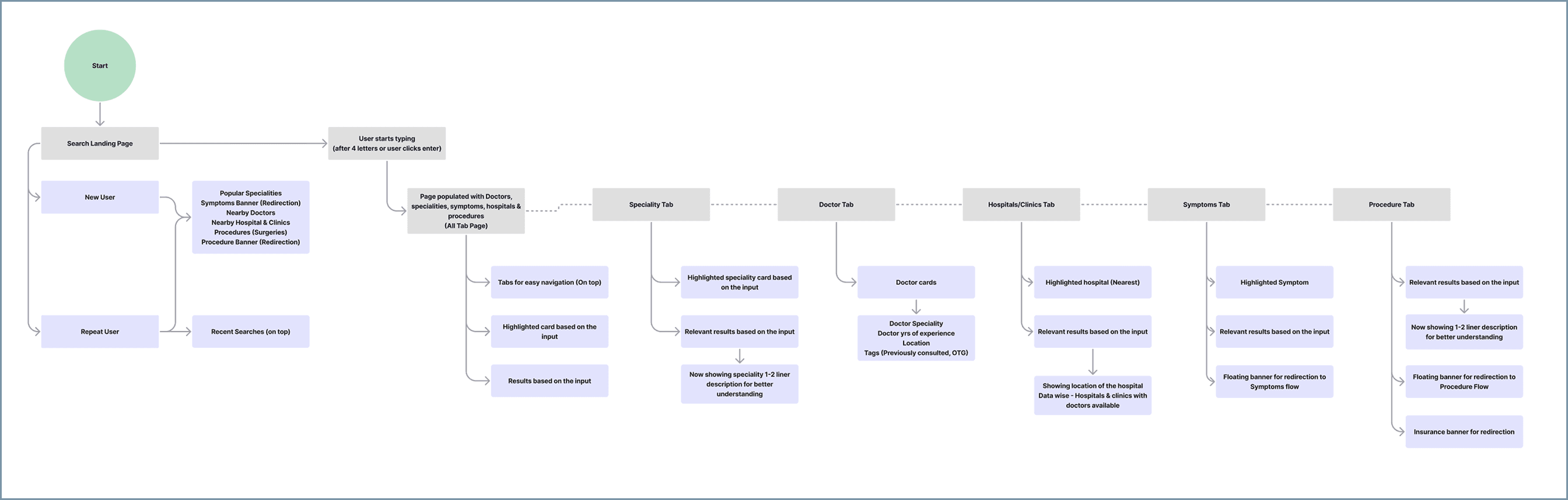
Search 2.0 flow chart

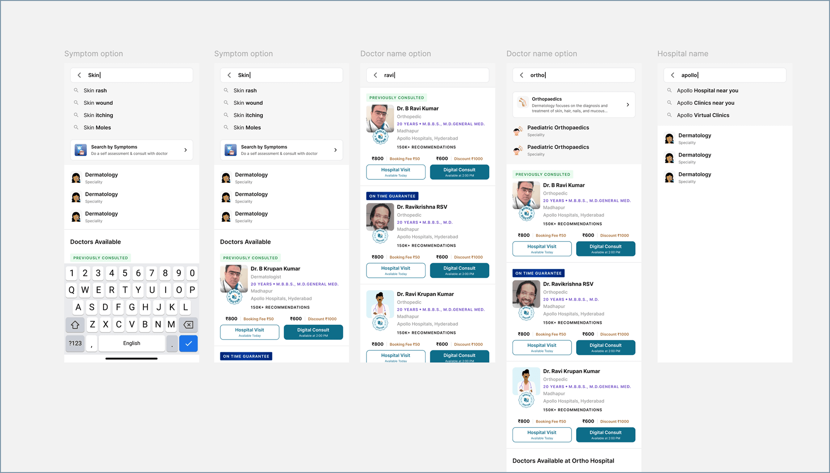
// THE "BEFORE" — FAILED EXPLORATIONS

The evolution of the search card.

Early iterations across Symptoms, Hospitals, and Procedures revealed two major UX flaws in testing:

Failed highlights

The most relevant, top-tier suggestions used a basic grey background and generic magnifying glass icon — blending into the list instead of standing out.

Fragmented visual language

Specialities, Doctors, and Hospitals each got different visual treatment and data density — forcing users to re-learn how to read results with every scroll.

Early search card explorations across Symptom, Doctor, and Hospital options

// THE "AFTER" — STANDARDIZED SOLUTION

One card system. Every entity.

Early iterations across Symptoms, Hospitals, and Procedures revealed two major UX flaws in testing:

A unified card architecture

One standardized card format scales across all entities — Doctor, Hospital, Speciality, or Procedure now share identical visual treatment.

Clear information hierarchy

Top results elevated into distinct standalone cards, plus top-level chips (All, Speciality, Doctor, Hospital) to instantly filter what matters.

Progressive disclosure

Secondary data like booking buttons and pricing removed from search level — focus stays on Who (name), What (speciality), Where (distance).

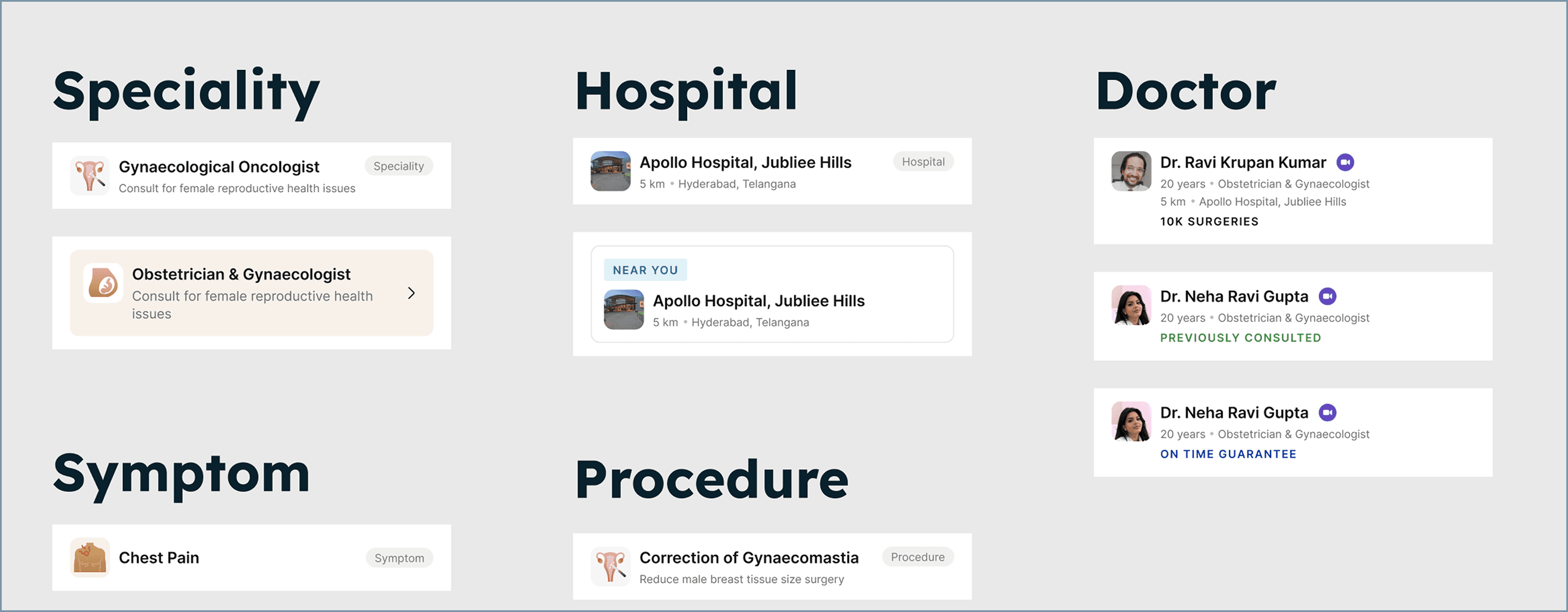
// THE UNIFIED CARD

Same shape. Any entity type.

The same card format now scales cleanly across Speciality, Hospital, Doctor, Symptom, and Procedure results.

The unified search card grid across Speciality, Hospital, Doctor, Symptom, and Procedure entities

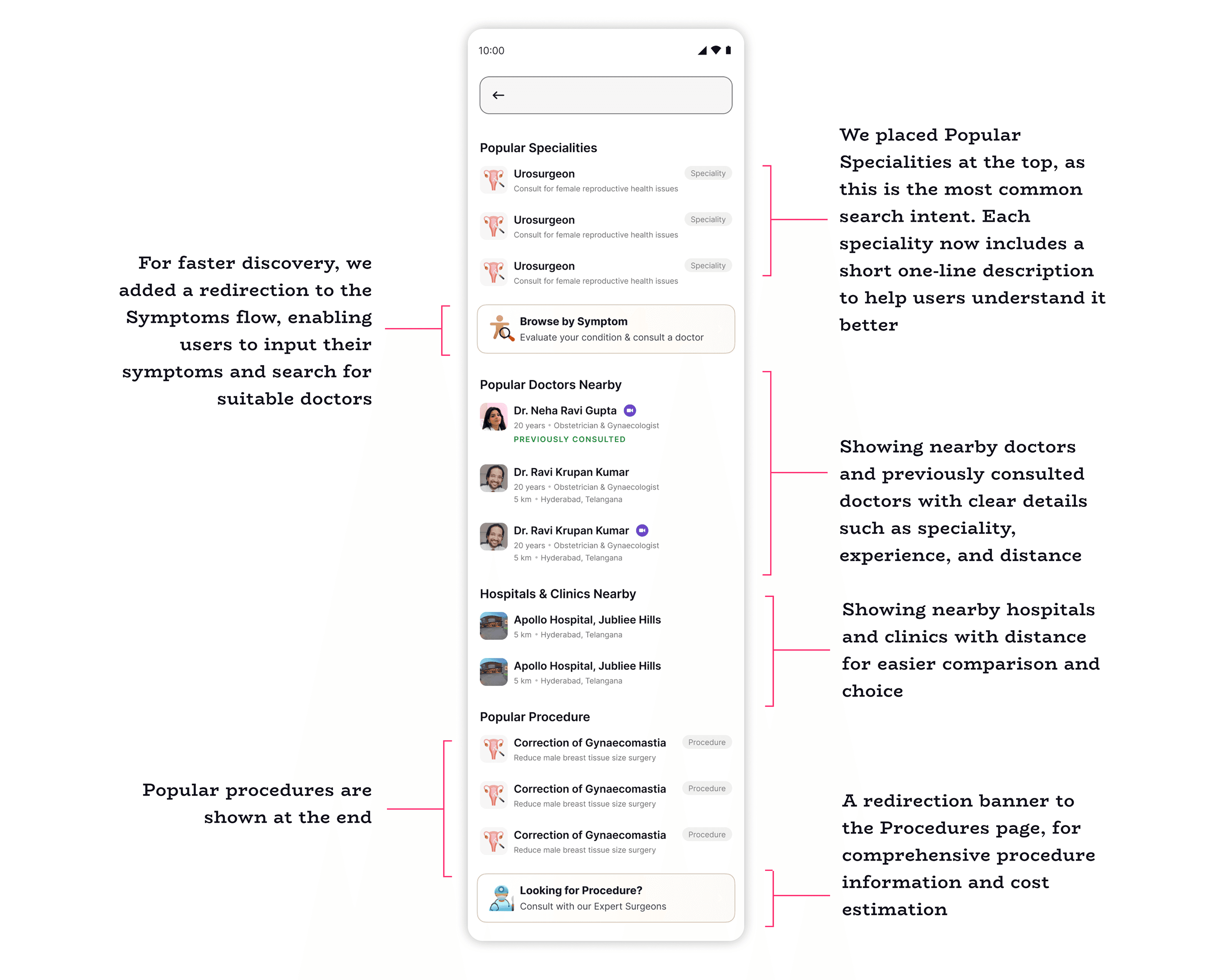
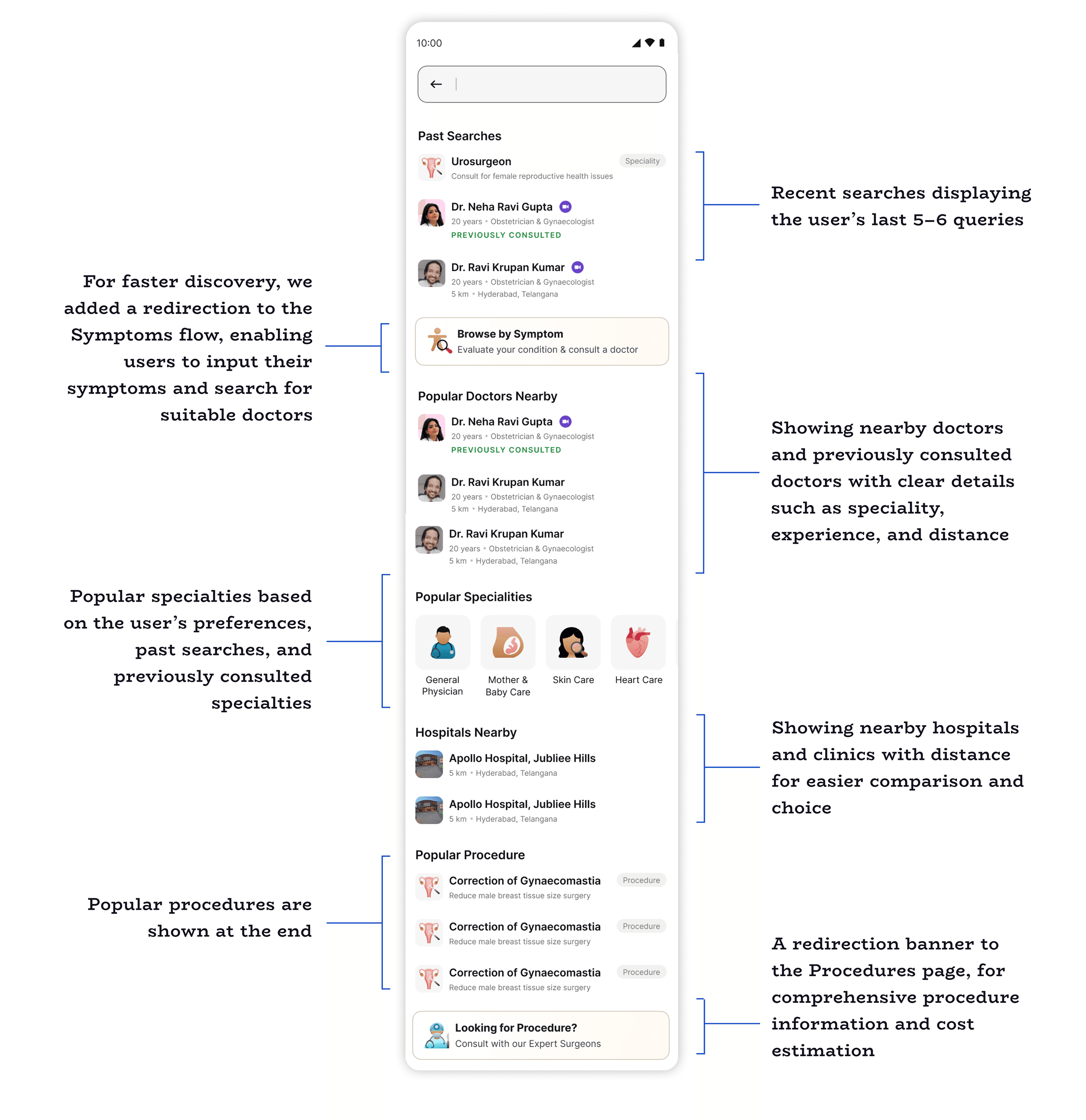
// LANDING PAGE

From a blank screen to a useful one.

BEFORE

Users with no past searches saw a blank screen with only the search bar at the top — zero guidance, zero starting point.

AFTER

Now surfaces relevant suggestions based on location, preferences across verticals and previous visits to Apollo Hospital — useful from the first interaction.

// DESIGNS

Landing Page - New User

Search landing page for a new user

Landing Page - Repeat User

Search landing page for a repeat user

All Tab Selected

Search results, All tab selected

Speciality Tab

Search results, Speciality tab selected

Doctor Tab

Search results, Doctor tab selected

Hospital Tab

Search results, Hospital tab selected

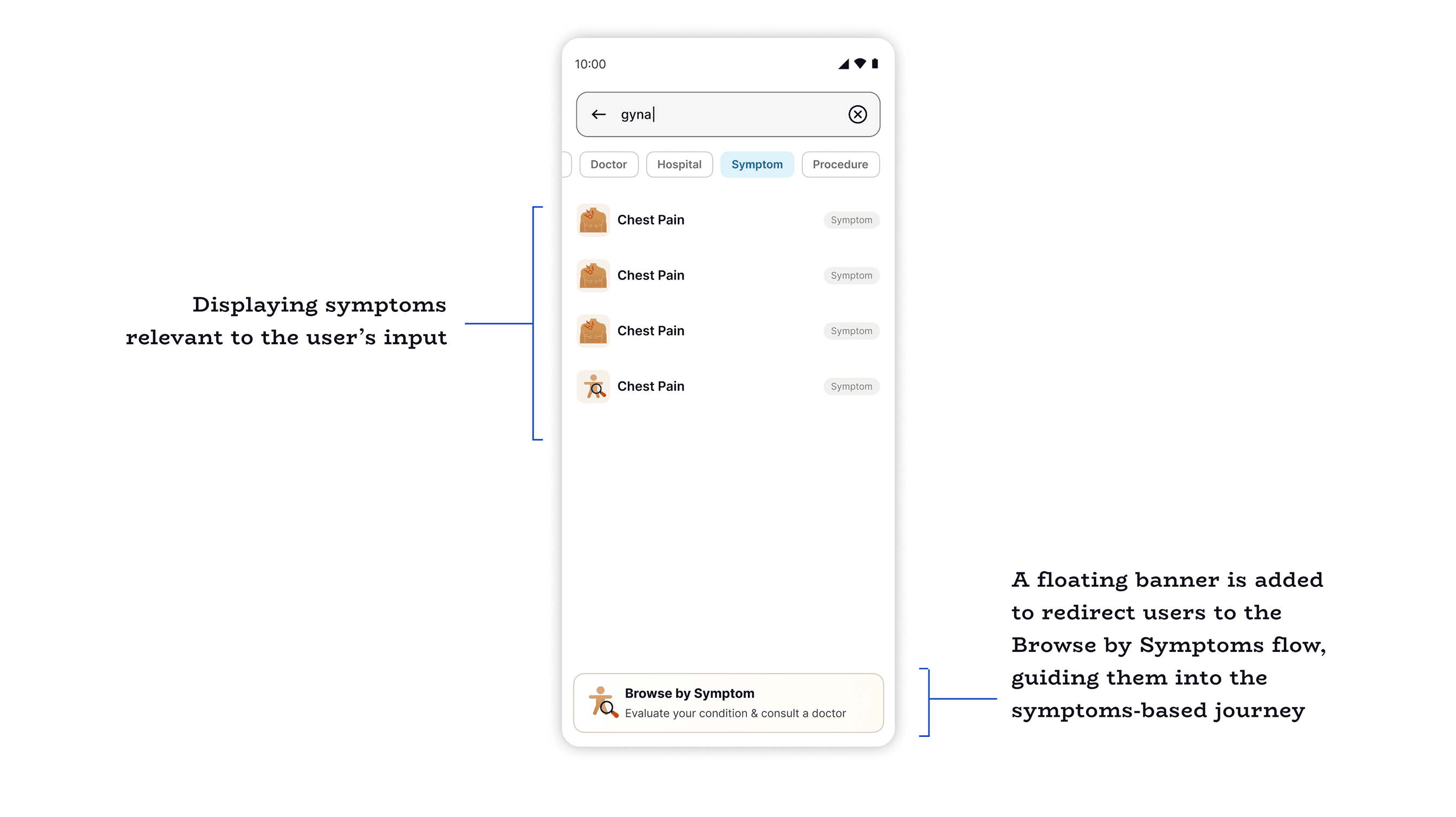
Symptom Tab

Search results, Symptom tab selected

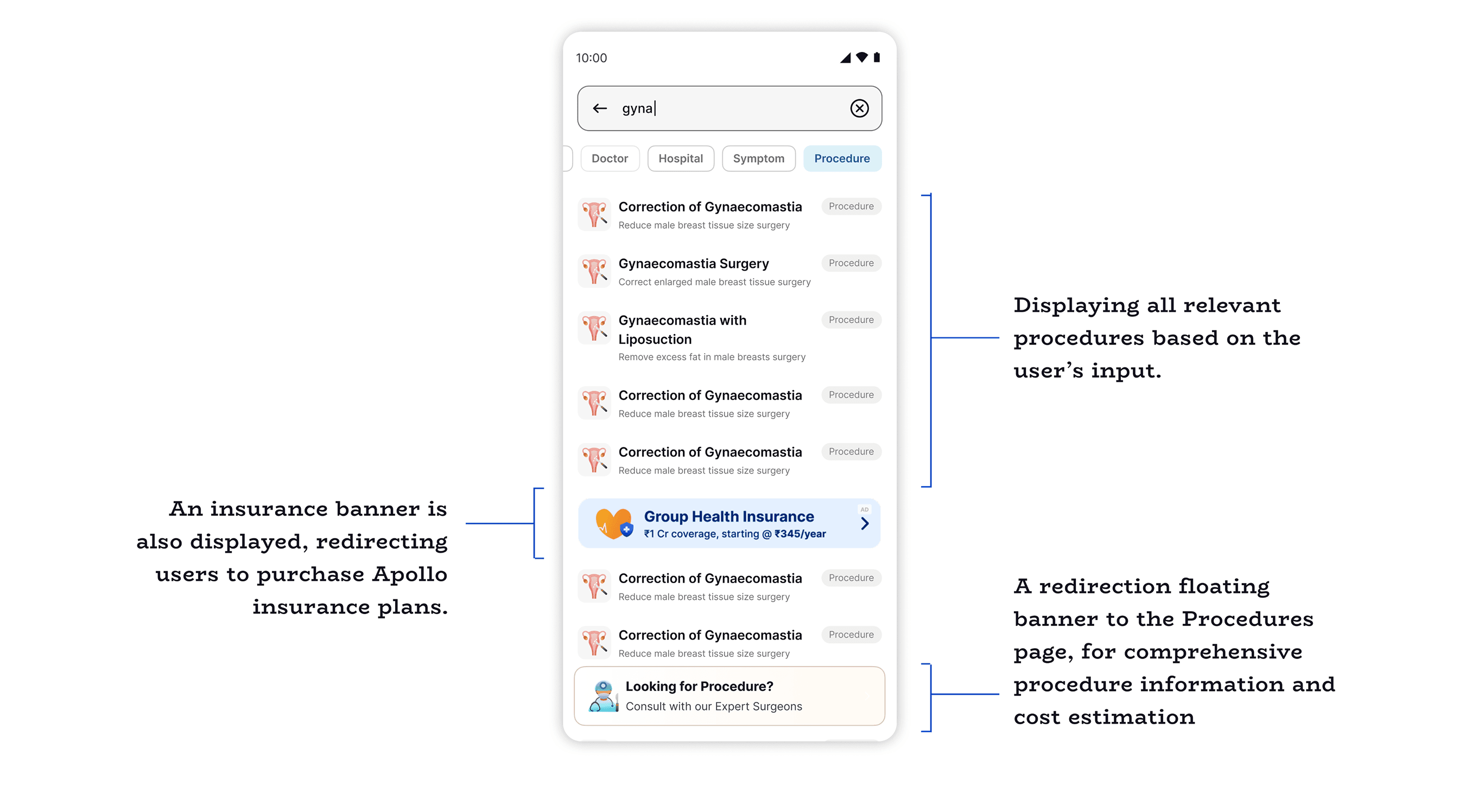
Procedure Tab

Search results, Procedure tab selected

// METRICS & OUTCOMES

Search that finally earns user trust.

+22%

Increase in doctor card clicks - better ranking + key details

~18%

Reduction in search refinements - clearer cues, fewer attempts

+10%

Increase in consult conversions from the search funnel

+30%

Improvement in location relevance accuracy

+10-12%

Increase in broad symptom queries — "skin", "gas", etc.

1

Unified card system, replacing 3+ fragmented layouts

That's a wrap.

Search 2.0 is live on Apollo 24/7 today. Future scope includes deeper symptom-to-speciality mapping, building on the broad query increases already seen.


Other Case Studies


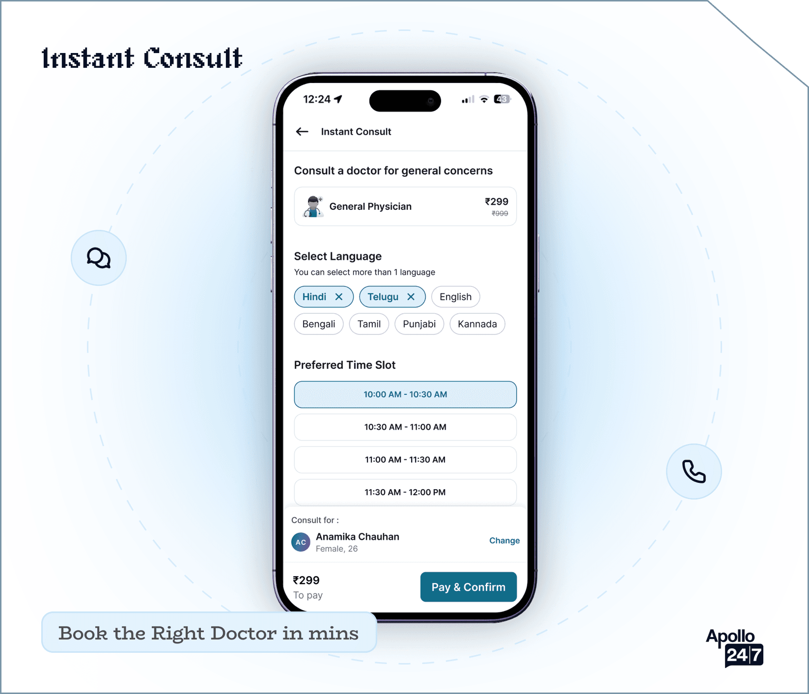
Instant Consult mockup

Instant Consult

A high-priority feature designed to facilitate rapid, on-demand medical consultations, connecting users with healthcare professionals instantly when time is of the essence.

View
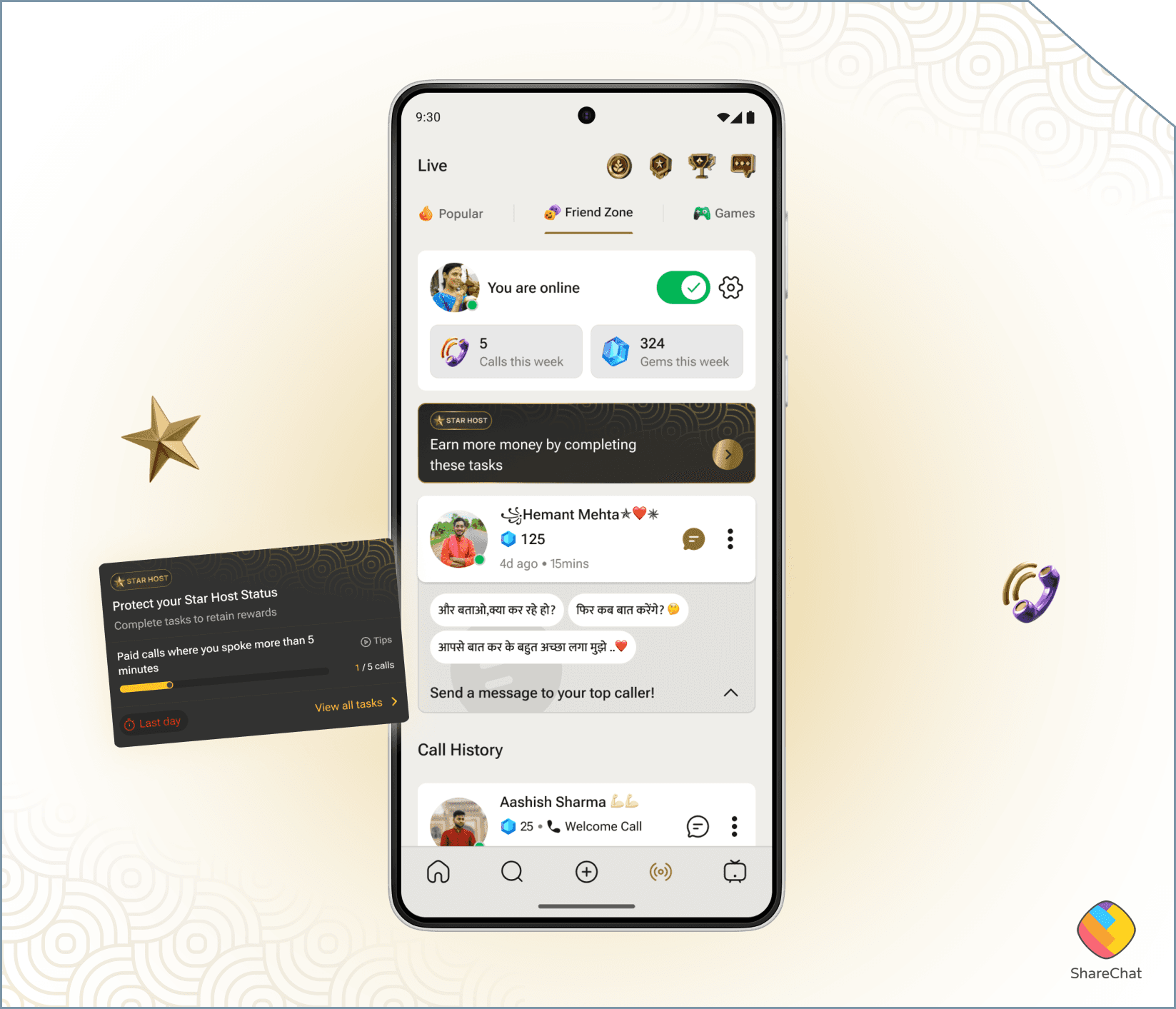
Star Host Program mockup

Star Host Program

FriendZone's host ranking was invisible — hosts had no idea why some earned more than others. I designed a system to make that ranking transparent, actionable, and motivating for a non-tech-savvy audience.

View